Designing book covers is fun! I’ve always thought so but have not been so intimately involved in the process until recently. I’m working with ePublisher Gere Donovan Press to bring my best selling German series, Mapper, to the United States. We decided to expand the three book series into six parts for U.S. readers. Here’s the visual process we went through to come up with our final (and awesome) designs!
In August, Gere Donovan sent me this image with the idea that the cover would stay the same for all six books but with different titles.
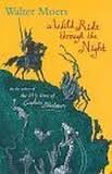
It didn’t win my team over – spoiler, there is no giant spider in my story – it was a little busy for the eye, we wanted different cover images for each book, and there was something oddly familiar about the illustration. Upon some research, I discovered that it was the same image used for Author/Illustrator Walter Moers’ book, A Wild Ride Through the Night.
The illustration is in the public domain, as it’s one of hundreds of engravings created by Gustave Dore. That got me thinking…
….I looked up Gustave Dore and found other images. Did I mention there are hundreds?
‘Hello, Photoshop!”
While I messed around on Photoshop, I conducted a highly scientific survey of friends (a one-line Facebook post) about the proposed book cover from Gere Donovan. Many liked the artistic look of Dore’s work. But my team and I wondered…”will it sell books?” I recalled once talking books with THE buyer for a major retailer who said definitively, “I can tell if a book will sell by its cover.”

She then looked down at the copy of my soon to be released book The Dead Boys. Let’s just say she did not immediately place a big order. (Insert sad face here and shameless plug – if you loved the new series Stranger Things, you will also love The Dead Boys.) Anyway, back to the Mapper Series covers. My team decided to experiment with something more modern-looking.
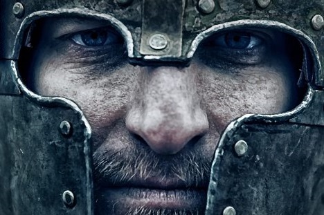
We raided iStock and other photo sites to find some images with cool looking knights and came up with these.
We kind of liked them. But some of our friends from the follow-up Facebook survey thought they were boring. Too traditional.
We probably spent way too much time on this process (but hey, I was having fun) and then decided we should have a conference call with Scott from Gere Donovan. We fretted about letting them know that we weren’t sold on their first idea (the Gustave Dore image). But we shouldn’t have been so worried. Five minutes into the call, Scott said he was really happy that we didn’t like the cover! Upon reflection, he had already decided he didn’t like it either. Phew! After further discussion, Scott suggested that we could use more modern images and cited some trends he’d recently noticed in book covers. We liked his thoughts and, after several rounds of shuffling images between six books, Photoshopping, and further extensive surveying of our beta viewers, we loved what they came up with!
Oh…and by the way, they are Kindle-ready by by clicking here!
Enjoy!


I really liked this post. Thank you for taking me through your process. The result makes an appealing set.